Choosing the right color scheme for a room isn’t just about picking your favorite shades. It’s about creating a cohesive environment that feels intentional, supports the room’s function, and reflects your style.
From color psychology to lighting effects and design trends, here’s a complete guide to help you choose the perfect color scheme for any room in your home.
Understanding the Basics of Color Theory
Before selecting a palette, it’s essential to understand the fundamentals of color theory:
- Primary Colors: Red, blue, and yellow. These cannot be made by mixing other colors.
- Secondary Colors: Green, orange, and purple. These are created by mixing two primary colors.
- Tertiary Colors: The result of mixing a primary color with a neighboring secondary color.
Key color schemes to know:
- Monochromatic: Variations of a single color.
- Analogous: Colors next to each other on the color wheel.
- Complementary: Colors opposite each other on the color wheel.
- Triadic: Three colors evenly spaced around the color wheel.
Step 1: Consider the Room’s Purpose

Colors influence mood and perception. Think about how you want to feel in the room:
| Room Type | Ideal Mood | Suggested Color Families |
|---|---|---|
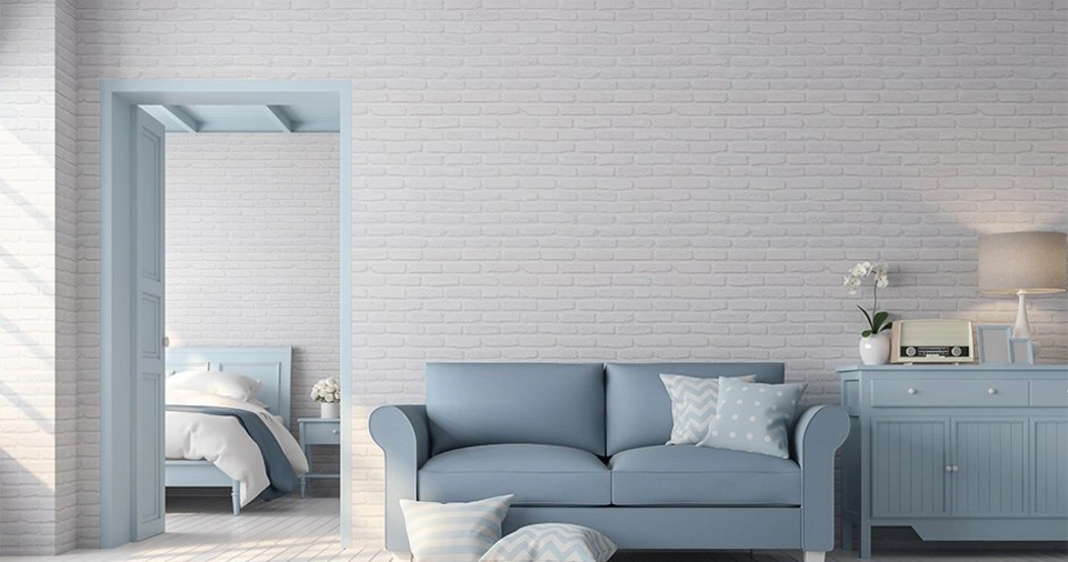
| Bedroom | Calm, restful | Soft blues, muted greens, lavenders |
| Kitchen | Energetic, clean | Bright whites, yellows, greens |
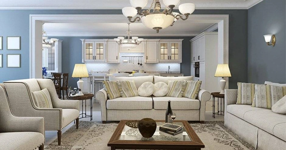
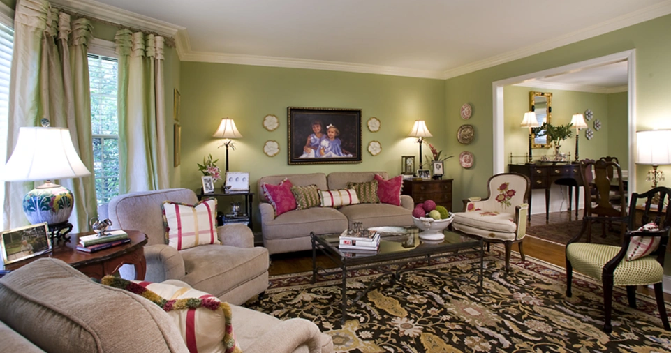
| Living Room | Welcoming, cozy | Warm neutrals, earth tones, taupe |
| Home Office | Focused, motivated | Blues, greens, beige |
| Bathroom | Fresh, relaxing | Cool tones, aqua, light gray |
Step 2: Assess Lighting Conditions
Lighting dramatically affects how colors appear:
- Natural Light: South-facing rooms get warm light; cool tones balance this. North-facing rooms get cool light; warm colors prevent the space from feeling cold.
- Artificial Light:
- Incandescent bulbs: Add warm, yellow tones.
- Fluorescent bulbs: Lean toward blue tones.
- LEDs: Come in various color temperatures.
Tip: Always test paint samples under different lighting conditions.
Step 3: Start with a Neutral Base
Begin with neutral tones for walls or large furniture. Neutrals offer flexibility and allow for easier updates. Examples include:
- Warm: Beige, taupe, cream
- Cool: Gray, white, greige
You can layer in bolder colors with accessories, textiles, and art.
Step 4: Use the 60-30-10 Rule
This timeless interior design rule helps achieve balance:
- 60% – Dominant color (walls, large furniture)
- 30% – Secondary color (upholstery, curtains)
- 10% – Accent color (decor, artwork, pillows)
Example: In a living room, you might choose a soft gray (60%), navy blue (30%), and mustard yellow (10%).
Step 5: Factor in Existing Elements
Your flooring, cabinetry, tiles, and countertops all contribute to the room’s color story. Work with them, not against them. Pull tones from existing features to create harmony.
Step 6: Add Texture and Pattern
Color isn’t just about paint. Rugs, textiles, and materials like wood, metal, and glass add dimension. Patterned accents help balance or highlight certain hues.
Step 7: Sample Before You Commit
Paint samples look different on walls than they do on swatches. Buy sample pots and paint large patches to see how the color shifts throughout the day. Pay attention to:
- Time of day
- Direction of sunlight
- Artificial light types
Trending Color Combinations (2025 Edition)
| Style | Color Combination |
|---|---|
| Scandinavian | White, soft gray, muted pastels |
| Modern Farmhouse | Warm whites, olive green, matte black |
| Coastal | Seafoam, sandy beige, crisp white |
| Urban Industrial | Charcoal gray, rust, steel blue |
| Bohemian | Terracotta, ochre, teal |
Color Psychology in Interior Design
Colors impact behavior and emotion:
- Red: Stimulates energy, appetite — good for dining rooms.
- Blue: Calming — great for bedrooms or offices.
- Green: Restorative and refreshing.
- Yellow: Cheerful and stimulating — use cautiously.
- Purple: Sophisticated, creative.
- Neutral tones: Stable and versatile.
Using Color Tools and Apps
Leverage technology to preview color schemes:
- Sherwin-Williams ColorSnap
- Benjamin Moore Color Portfolio
- Pantone Studio
- Canva Color Palette Generator
- Coolors.co
These apps help visualize combinations and generate palettes from photos.
Mistakes to Avoid
- Ignoring lighting variations.
- Using too many bold colors.
- Forgetting the undertone of your paint.
- Over-matching furniture to walls.
- Neglecting flow between adjoining spaces.
Conclusion
Choosing a color scheme is part science, part art. It requires a balance of personal taste, room function, and environmental factors. By understanding color theory, using design principles like the 60-30-10 rule, and testing in real conditions, you’ll make decisions that feel right long term.
Whether you’re refreshing a single room or renovating an entire house, a well-thought-out color palette ties everything together. It elevates your space from functional to exceptional — one carefully chosen shade at a time.